Having produced my graphics to support my film I naturally acquired a title for the film; 'Innocence' which mainly came about from assessing the content and principle of my film. When I went to screen the film I decided to give a brief summary of the film to allow the audience to understand my intentions and reasons for producing the film in the way I did. At the time of screening I hadn't titled the film and therefore my brief speech was necessary. If I had of had the title for the film 'Innocence' at the time of the screening I believe I wouldn't have needed to give a speech as the title gives a lot away. The word when placed with the content of the film works well in supporting the footage.
I had an ethical issue regarding the age at which my sister is and the parental restrictions of the films I was showing her. The two films American History X and Inglorious Basterds are both rated 18 certificate and my sister is 16. As this was the case I just notified my mum to ask if it was okay to still film.
I believe my film is quite unique in as far as it is one consistent shot which works very well. The composition is great with the musical related posters in the background contradicting the background and stereotypes of a 16 year old girl. In as far as film makers and related films there are influences I have had from experimental artists such as Bill Viola for the way in which I challenge an audiences perception on a subject. Apart from that I don't think there are any films/film makers which are noticeably close to my film.
My other interests in art relate to portraiture and painting, possibly a link to the angle and composition I chose for the film. The sound within the film is diegetic and taken completely naturally to involve the viewer more with my sisters reactions. It is also easier to follow from her perspective and the audience can empathise better with her movements.
There wasn't too many problems that rose from filming and I managed to keep everything simple. The only thing that could have caused some confusion was the fact that the film was shot in a 20 minute tape with the 3 separate films showing. Therefore I had to edit the shots to get the best movement and parts of the film into shorter more active lengths.
I have studied Media at AS level and achieved a B grade. I thoroughly enjoyed the Media course as it focused on areas such as film and music which are a significant part of my life. I still carry the skills I acquired on the course with me today and my viewpoint on the film and music industry has shifted slightly. I analyse film makers intentions and decisions differently assessing films in a more sceptical light.
If I were to produce this film again I would maybe chose a different subject matter and scenario and possibly comment on themes such as life and identity. The theme of identity would probably result in filming in public locations or a more challenging way of filming. I would also link my film towards Christopher Nolans film such as Inception and push myself with the complexity of the story.
Overall I am satisfied and impressed with the result of my film and am glad I have produced it in the way that I did. In future I will possibly continue with my interests in film through a more time consuming experiment using more camera angles and shots.
Monday, 23 May 2011
Tuesday, 3 May 2011
Graphics
As part of the graphics element of the course I am required to produce a poster and business card supporting my film. The business card is a small contact card with details of the director and producer. The poster is an A4 advertisement consisting of key aspects of the film as a slight suggestion towards the films plot and storyline.
I am researching posters and graphics of the films I have included in my film as well as other poster ideas including Polish posters, minimalistic posters and mainstream Hollywood posters.
Polish posters ;

There is a very unique and peculiar style regarding the design of the Polish film posters. For example the poster above is regarding the Martin Scorsese 1980 film 'Raging Bull' from which the fighting scenes of the film are projected through the abstract graphic.
Another Polish poster which caught my eye, is the film poster for the 1999 David Fincher masterpiece 'Fight Club'. A large part of the film surrounds the character Tyler Durden who is pictured centrally on the poster, a reflection the characters personality and influence in the film.

Another Polish film poster which cleverly suggests the storyline and plot of the film is this poster below of the 1998 Coen Brothers lazy adventure 'The Big Lebowski'. If you have seen the film you can fully understand the colour choice and composition of the poster which implies drug taking and certain characters behaviours and how they are included in the film.

Hollywood Film posters;

Looking at Hollywood film posters which I feel reflect the majority of mainstream films, I think that there is a running theme amongst the style and composition of poster, especially when used as a commercial tool. Take for example this poster of the 2004 Wolfgang Petersen drama 'Troy' which is an adaptation of a historical event. What I think is particularly common with the general presentation of these mainstream blockbuster posters is the fact that they heavily suggest scenes from the film and identify key characters to the plot. In this poster we are shown Achilles and Hector who in the film have a honourable and skilled fight to the death.

Once again I have selected to look at 'The Hangover' which was a 2009 box-office success directed by Todd Phillips. In this poster there is again strong suggestions to scenes in the film as we are shown the main characters to the film. Revealing the identity of the cast and also implying areas of the plot it is subtly self explanatory which is fairly interesting in its own right.

Here is a final Hollywood film poster that I have chosen to look at in aid of my graphics for my film. This poster presents the 2007 success 'There Will Be Blood' directed by Paul Thomas Anderson. The poster displays a fire to the left fuelled by oil which is once again a implication towards the storyline and setting of the film. Daniel Day Lewis is indicated in the upper right looking away from the destruction possibly purposely to hint the attitudes and personality of his character.
I feel looking at Hollywood posters has certainly left me wondering how I can use parts of my film to suggest plot, storyline and setting as well as identify the characters involved.
Minimalistic Film posters ;

This is a minimalistic film poster of the 2006 Michael Mann crime thriller 'Miami Vice' which is heavily based on the TV series of the same name which aired from 1984 - 1990. The design of the poster strongly suggests the use of cocaine which was a common theme included in both productions. The TV series acquired a more successful following and the colour choice included in the poster is strongly related to the vibrant 80's lifestyle. After first viewing I am very intrigued by the minimalistic idea of a poster as it's stylistic bluntness cuts straight to a key element of any film.

Here is another minimalistic poster of a well known film 'Jurassic Park' which is a 1993 classic directed by Steven Spielberg. Immediately the poster presents you with a hint towards the content of the film. However, I find it very interesting how the use of the water in the cup is taken out of context of the film and made to seem humorous because the scene in which it is used is made to seem terrifying and signify danger.

The use of the axe in the centre of this poster for the 1980 Stanley Kubrick horror 'The Shining' snatches the focal point to the composition and instantly connotes horror as well as thriller. I find that the black background works well in surrounding and supporting the axe as it seems to be almost motionless in the middle of the poster.

Of all of the minimalistic posters I researched on the Internet I took an immediate liking to this poster of the 2008 Jon Favreau superhero blockbuster 'Iron Man' which I find intimidating and suggestively evil. I'm not a particularly huge fan of film however the composition and design of this poster interests me more than most of the film. This is purely because of the design of the eyes which connect well with the viewpoint of the 'Iron Man' as well as present his supernatural ability.
Having looked at a number of different graphic designs for posters I am eager to begin drafting poster designs related to my film.
Here is an initial drawing of a supposed poster for my film. I initially sketched this reminding myself of what I had looked at in Hollywood posters. As you can see the composition reflects the camera shot of the entire film which I think is a good foundation to work upon, however I must remember that the poster has to be eye catching and abruptly intriguing to the observer.

The content is very restricted so I have progressed further including elements from the three films I had my sister watch (Inglourious Basterds, American History X and The Hurt Locker). Using just a select piece from each film is rather tough as the poster becomes far to congested, much like that of a Hollywood film poster as it reveals far to much information about the film.

The drawings are reproductions of elements of each of the films posters. The main problem as been making sure that my sister remains the central figure. Having tried a rather complicated way of producing a film poster I am now going to attempt a poster using a minimalistic technique to help me. I enjoyed looking at the minimalistic posters as I very much liked the way in which they slightly suggest the film without giving too much away.

Here is a photograph of what I believe will be my poster supporting my film. In making this photograph, I decided upon a title for my film; 'Innocence'. I believe this fits well to the setting and intergrity of the film. I decided to work on a black background much like the minimalistic 'Iron Man' poster which emphasises the eyes. In my case I have tried to stress the shock and innocence of my sister through two wide open eyes looking toward a television set facing away from the viewer. I feel I have achieved some success with this design as it loosely suggests the film without giving away to much information.
Monday, 2 May 2011
My film
Having filmed 20 minutes worth of footage covering each one of the 3 scenes, I am now in the process of editing. I am pleased with the outcome and I am looking forward to cutting the footage down into short yet exciting parts. Here are some snapshots of my sister watching the 3 scenes from the 3 films.

This is a snapshot of her right at the start to help show how settled she is before I began playing the first scene which is from 'Inglourious Basterds'. The scene consists of brutal violence as the 'Bear Jew' beats a Nazi officer with a baseball bat.

This is a second snapshot of my sister as she becomes more engrossed in the film.

Here is a third snapshot and as you can see she has started to become more and more interested with the film.
Tuesday, 26 April 2011
Further investigation into my influences
Before I finalize my film I am going to research films that are similar in there integrity and impact. One film which instantly sprung to mind is the 2007 Box-Office success 'Paranormal Activity' which features a young middle class couple finding their feet in their new suburban house. There was a considerably high level of hype surrounding this film, mainly down to the fact there was a small budget. This of course asked the questions; 'Can a small budget still buy enough horror for the mainstream?' and 'How will it compete against the expensive, powerful films of Hollywood?'.
These questions were answered with a Box Office Gross worth of $107,917,283 USA dollars. A phenomenal achievement considering that the budget was estimated at $15,000. Despite all of this relating to the cost of production and filming, I believe the most relative aspect of my film with Paranormal activity is the camera angles and first hand filming. To demonstrate this, I have included a trailer of the film in this blog. Every scene, is achieved through the male partner filming first hand through a reasonably cheap camcorder.
Looking at the camera angles, movement of the camera, it really draws the audience in as the close up shots capture fear as well as the mid shots displaying a concentrated panic from the woman.
I feel that this is the closest film relevant to my film because of the basic filming and the element of observing the characters reactions to the demonic presence. Capturing that shock and fear is important to my film as my main purpose is for the audience to be viewing the film through my sisters reactions to the films I am showing her.
Tuesday, 8 March 2011
Development of Ideas
Before I progress with the filming I'm going to change the subject matter from my mother to my sister. This is because my sister has not seen or heard any of the films I've decided to show and therefore her reaction will be completely original and natural.
I also think that because of her young innocent personality, her reactions will reflect that of the 'pampered teenager' where by she is protected from the violence and brutal reality of our cultural history. I am experiencing some ethical issues as my sister isn't old enough to view the films however with the consent of my mother I feel I will be able to proceed.
I also think that because of her young innocent personality, her reactions will reflect that of the 'pampered teenager' where by she is protected from the violence and brutal reality of our cultural history. I am experiencing some ethical issues as my sister isn't old enough to view the films however with the consent of my mother I feel I will be able to proceed.
Tuesday, 14 December 2010
Installation Film
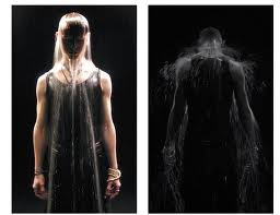
Bill Viola is the main installation film artist who was given to me for my research. Upon first reading and viewing of his work I felt that it was strangley dark and surreal. The general feeling I got when viewing his work was that of mystery as it appears to me his approach towards contemporary art challenges mainstream society. Hailed as one of the leading artists in the establishment of video as a form of contemporary art. Viola's work spans over 35 years and features videotapes, architectural video installations, sound environments, electronic music performances, flat panel video pieces, and works for television broadcast. With this you can imagine the experience in the industry is vast and one element to his work which I like is his ability use video to explore the phenomena of sense perception as an avenue to self-knowledge.

As you can see from this image the striking sense of suffering is almost to overwhelming. There is a soft sadistic atmosphere which I think is created through the dark lighting and composition of the water being used as a drowning effect. The use of the vest reveals more skin almost attracting a sexual element.
Looking at Bill Viola's work has made me think about possible ways to film. I feel that I won't take to much inspiration from Viola's work as it's too disturbing and surreal.
Tuesday, 16 November 2010
Experimental Film
Experimental film makers have definitely in my opinion been over shadowed by mainstream 'Hollywood' producers and their originality and unique blend of provoking a reaction as well as leaving the audience searching for a storyline has a selection of film fans hooked. The main purpose of experimental film is to challenge the mainstream, creating films which differ from the normal concepts of film in each genre. In some cases the film isn't given a genre, or doesn't suggest one. I find these particular experimental films contest mankind's existance often through creating new worlds and creatures. Sometimes, experimental film makers present their ideas and beliefs with a surrealist theme, Matthew Barney's 'The Cremaster Cycle' is a good example of a film maker producing very surreal and suggestions of symbolism through certain character representations. Here is a made up trailer for the entire Cremaster collection which spans over 8 years with 5 individual films;
As you can see from the trailer there are a number ideas suggested. I find that Barney has generated a metaphoric world to which he comments on human behaviours and mannerisms. There is also a strong element of sexual development as some of his characters represent human organs. For me Matthew Barneys work is quite refreshing as it's instantly bizarre scenery filled with mysterical creatures questions society's perception of artistic film.
Another experimental film artist I have looked at is Luther Price. Observing the opressive intensity and nature of Price's work he is fairly similar to the work of Matthew Barney. In many respects both experimental film artists invite the observers imagination into a uniquely pyschopathetic universe resulting in an isolated feeling of limbo as your mind is captured for the duration of the film.
Here are some snapshots of Luther Price's work.

As you can see from these pictures there is a strong horror element to which is the foundation for all of his films.

Despite looking at the work of Luther Price I believe it's aggressive and perculiar nature is too overwhelming to contemplate including into my work.
Subscribe to:
Comments (Atom)